I’m Afraid of My Slip Cover
“Design – An Anxious Opening”
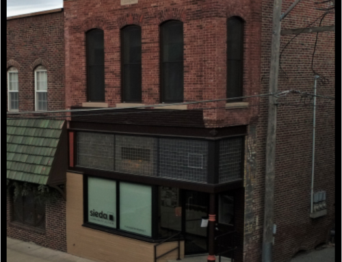
Not knowing what is behind the wrapping is always filled with anxiety when the “present” can cost you $. I did this project many years ago. The new owner of the building was a rookie investment broker looking to impress. I remember he worried, not knowing the condition of what we were about to uncover. I assured him that whatever it was, we could work with it. My perspective is to take the good and make it better. If it isn’t good news, we can still make it better. The solution doesn’t have to be the best on the block, but it will be respected; we’re taking off a poorly designed slip cover and providing the downtown with a design the community will feel good about.
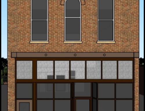
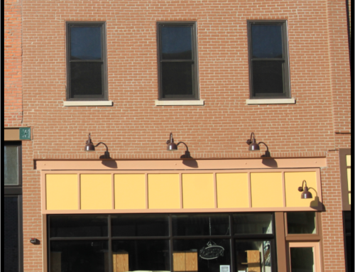
For this façade, the good news was all above the structural beam that supported the upper brickwork. We were able to accent the existing cornice brickwork, which was previously painted, by simply repainting and highlighting its architecture. The side and corner brickwork was shot, so we put in new. It sticks out a bit too much for me since we decided not to tuckpoint the interior painted brick. Had we tuckpointed and painted the individual bricks, the interior masonry would have blended better with the new. But, overall, we accented the old and brought it into modern times.
The area below the beam was not worth saving. The owner did not want a lot of light and heat transferred deep into his building, so we provided a wood framed panelized transom area above the windows. This provided an area for signage and allowed room for an awning, which provided depth to the façade as well as additional shade and color. We kept the floor-to-awning height windows, which was a great solution in my opinion, as it reinforced the vertical in a one story building. We replaced the recessed door in its original location. To finish off the side and corner, we created a simple historical-looking column design that framed the lower window section.
The end result is not an award winner, but I am proud of the solution relative to the dollars spent. This façade certainly fits the practical side of solid, respectful revitalization.


