Signage on your Facade
“Go HOG WILD . . . with Proper Scale”
 Signage is one thing that can easily be replaced over time. This gives you the option to be creative, unique, and inviting. The one “must” consideration is to properly size your sign based on available space on your façade. The infamous “mall” type sign is no longer an acceptable solution, because today we take the architecture of the building in such high regard. Most sign ordinances control the size of your sign based on the frontage of your building. They also attempt to control the material and type, however my experience says that it isn’t a city priority, and therefore not policed.
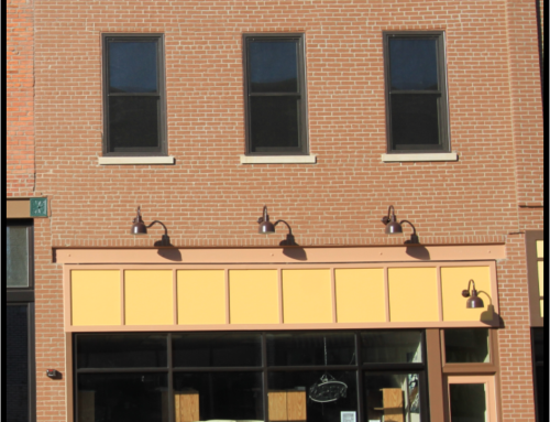
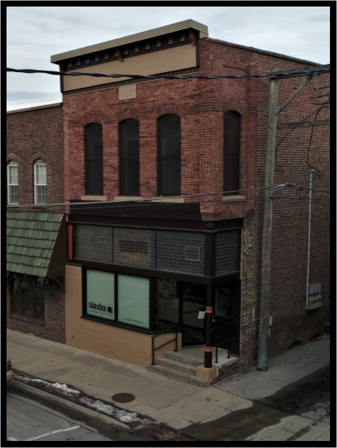
 In general there are two kinds of signs you should avoid. The first is a lighted box. This solution is often attached to the surface of the façade. To the right is a solution I did about 18 years ago. It is properly scaled and a nice clean box; however, because it sticks outward with little interest, it looks like an afterthought not worthy of incorporating into your façade design. Imagine how much classier it would be if this sign was single letters with small LED lights under the bay window.
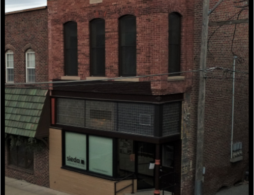
The second sign to avoid is that shiny flat metal sign with painted or vinyl lettering. Historically we did not have such shiny reflective materials on our buildings. These signs always seem to abuse the scale of the façade. These businesses are more interested in shouting than being part of the business clustering that makes a downtown successful.
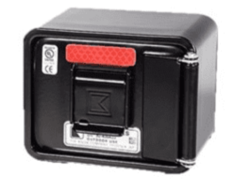
 My favorite type of sign is the high-density polyurethane foam. The sample to the left is simple in design. This product, however, allows for a great deal of creativity with its 3D capabilities. This product will last a long time, can be painted, and is easily installed.
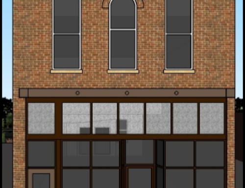
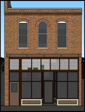
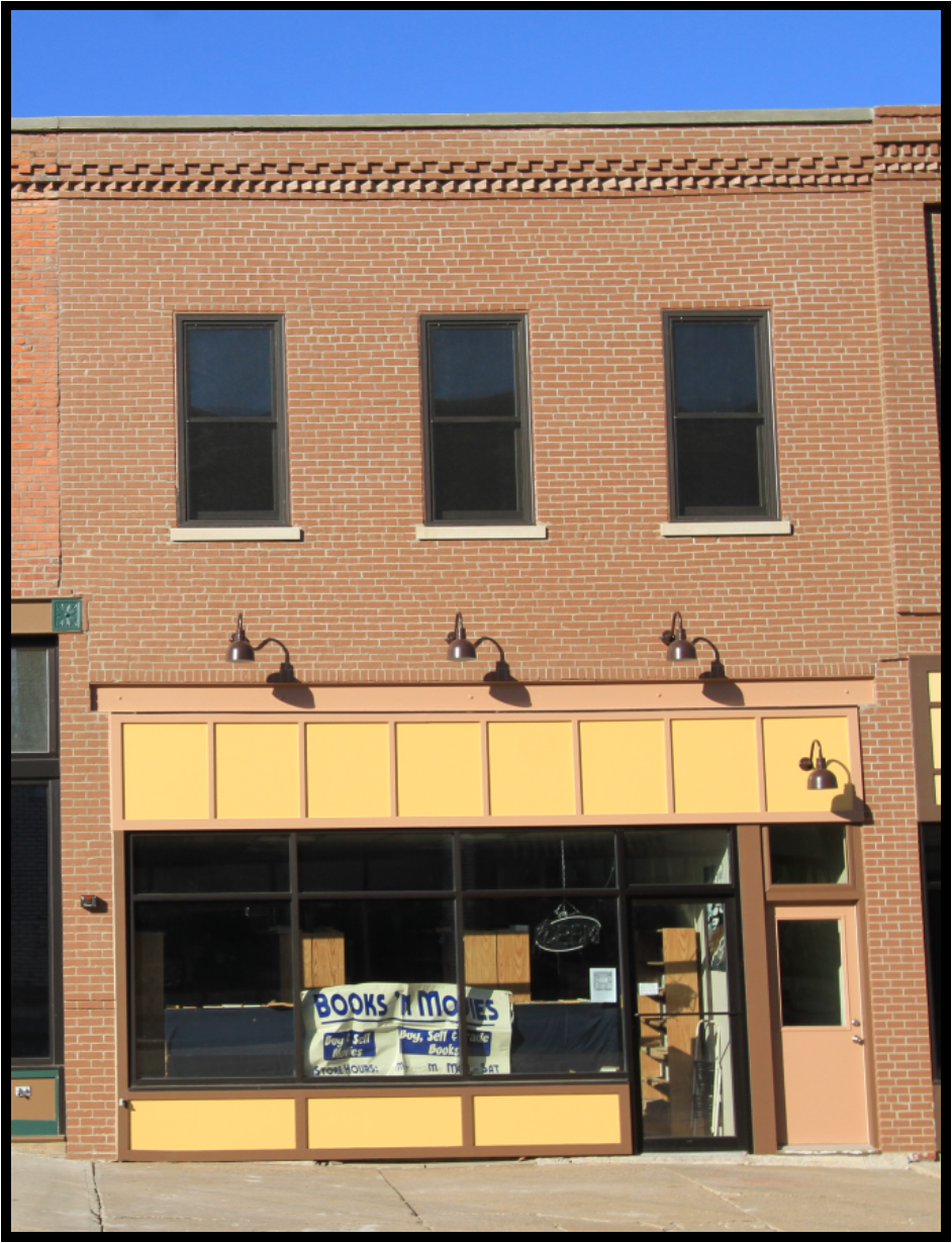
Notice the scale with plenty of edge space around the framed sign. A lot of people make the mistake of thinking the sign should be as large as possible, encroaching too close to the edges and making it feel forced. You can also see that the owner chose to center the sign according to the upper windows as opposed to the available framed area or based on the front door location. I commend his choice because you only see this sign from across the road or square, not walking along the sidewalk next to the building.
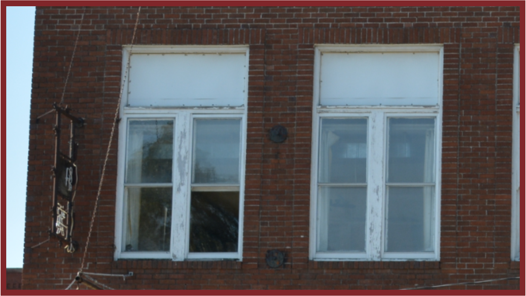
Speaking of walking next to the building . . . strongly consider a simple vinyl sign adhered to your window. In my opinion, this is the best location for signage. There is no need to shout these days for people to find you. GPS does a great job of that. You simply need to market your image.
